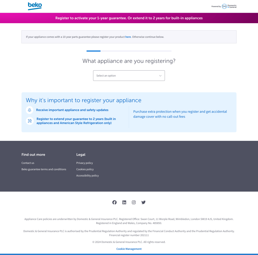
Domestic & General is a warranty and insurance business with a century of history. And since the rise of the internet, the company had built a sprawling estate of 130 websites for managing the warranty registrations of partner brands.
Despite the obvious similarities between the products on each site, there were significant differences in their user experiences and copy. This was resulting in conversion rates ranging from 0.3% to 5%.
Working with a UX designer and UI designer, I embarked on an 18-month programme to understand the best user journeys and unify the 130 websites.
Setting aside our own opinions, we started by bringing together real users into focus groups. We also used software to track user interactions on the live websites remotely.
The information gathered gave us ideas on how to adapt the copy, journey, and visuals. And further focus groups let us test our prototypes.
Once we were confident in a route forward, stakeholder management became crucial. Each website was designed to look like it belonged to the partner brand, despite being owned by Domestic & General. That meant we needed to get each brand on board with the proposed changes, which we did through a series of data-driven meetings.
When we started rolling out the new user journeys, we immediately saw improvements. Conversion on our worst-performing website leapt from 0.3% to 4.8%.
Click the image below to explore the user journey.